Selecting the perfect color palette for your interior design project can seem overwhelming, with so many potential color combinations to choose from. However, thoughtfully curating just three colors that work cohesively together can create a harmonious flow in any space.
In this comprehensive guide, we will propose three triadic color schemes, along with ten tonal variants for each, that you can seamlessly incorporate into any interior.
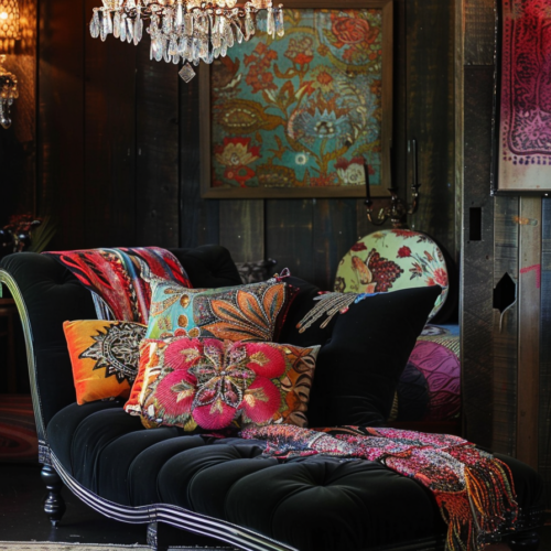
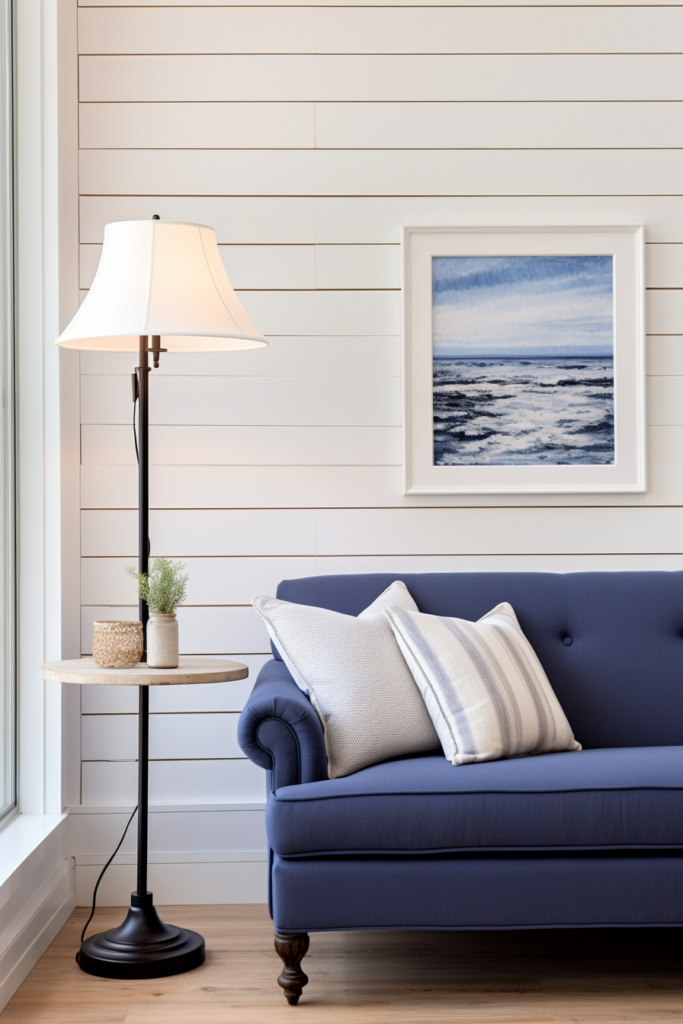
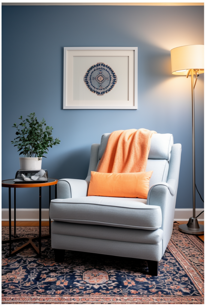
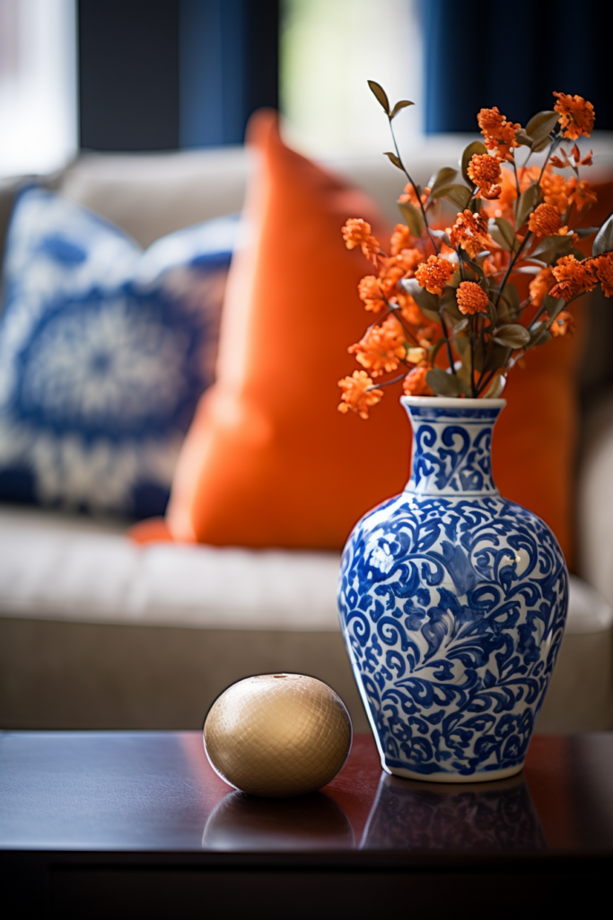
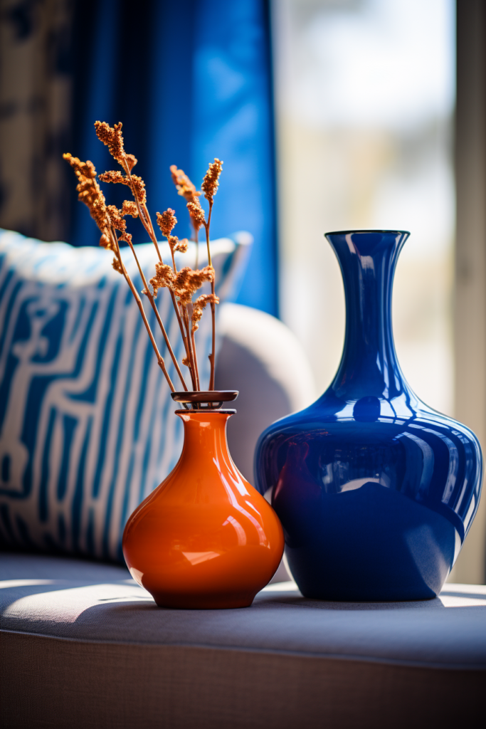
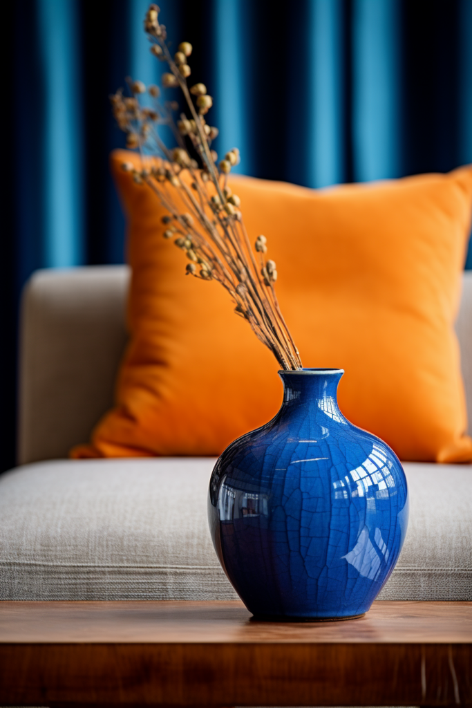
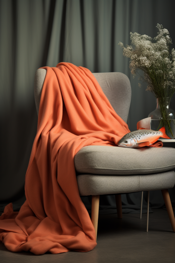
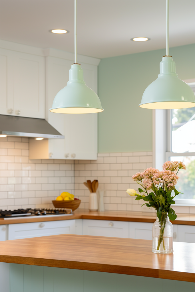
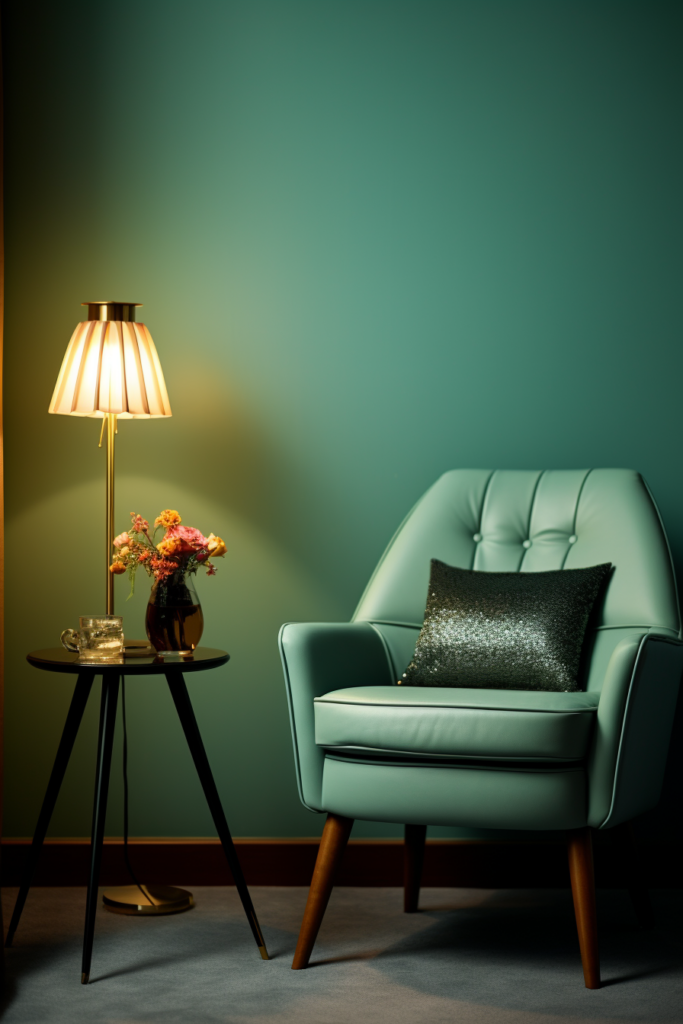
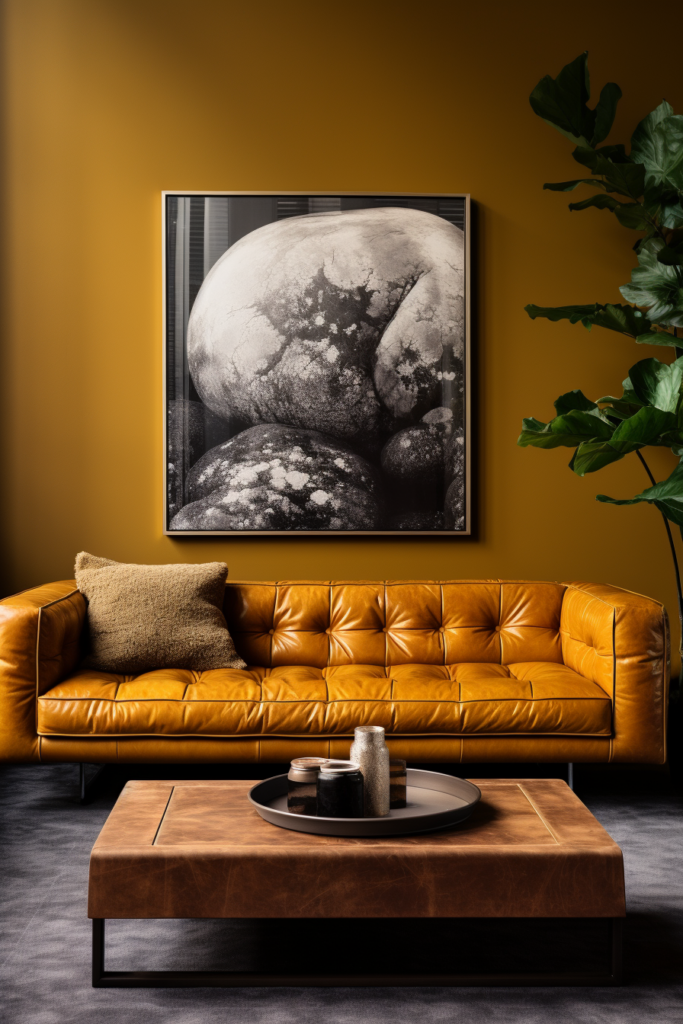
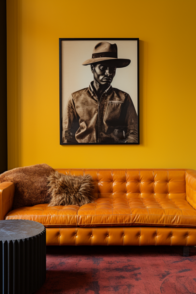
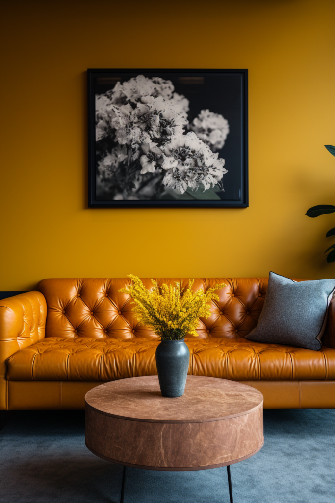
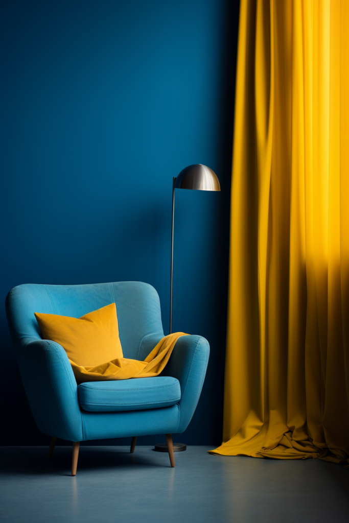
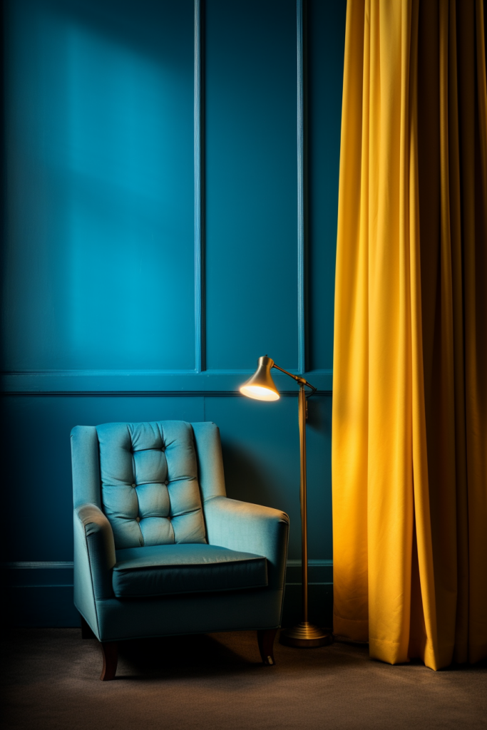
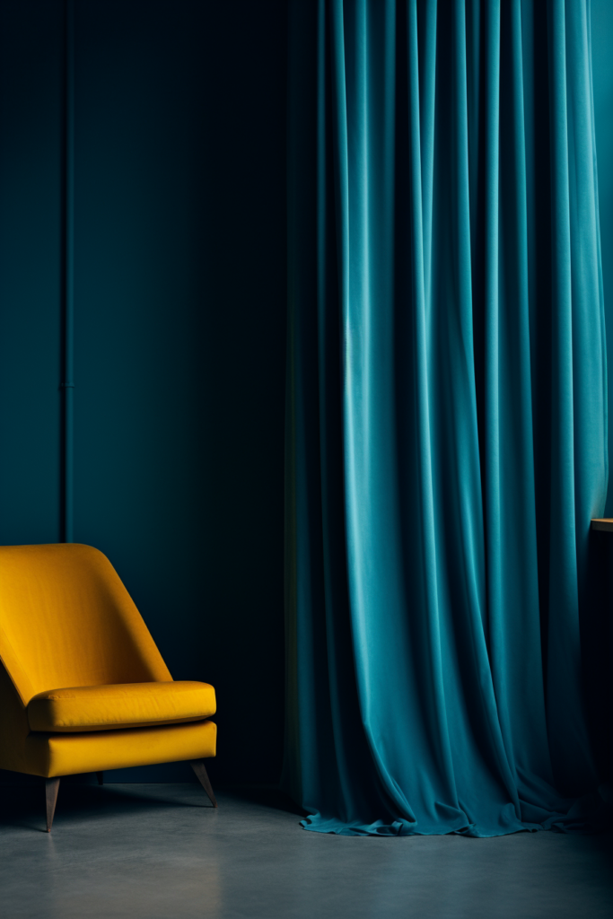
Color Scheme 1: Rich Blue, Vibrant Orange and Lime Green
Tonal Variants:
- Navy Blue – Deepest Shade
- Royal Blue – Saturated Brightness
- Periwinkle Blue – Soft Pastel Tint
- Blue-Gray – Muted Tone
- Denim Blue – Faded Favorite
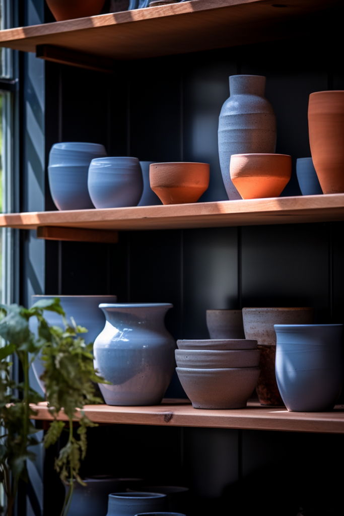
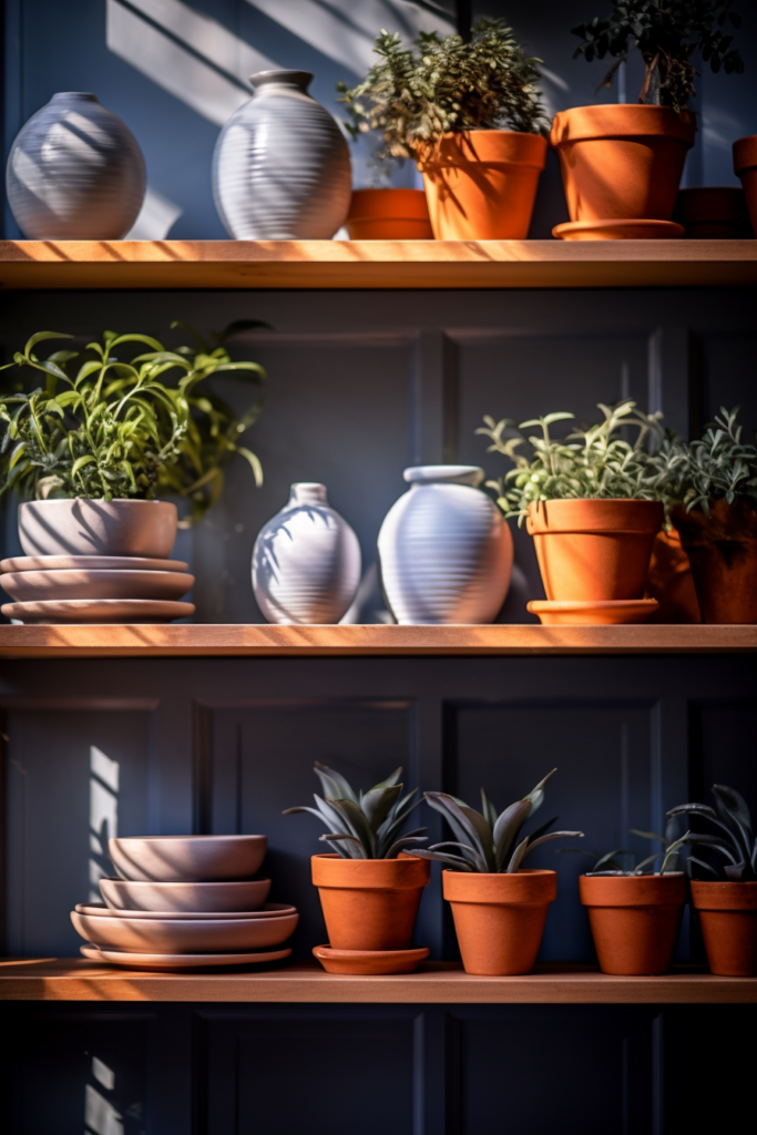
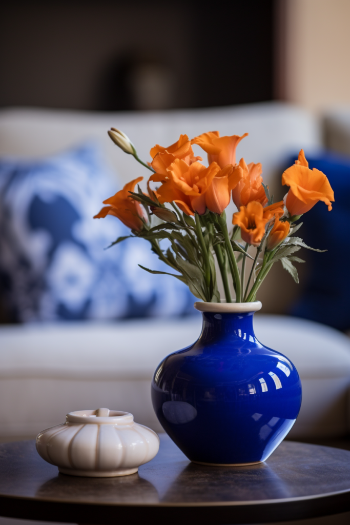
Accent Color 1: Persimmon Orange
Tonal Variants: 6. Vibrant Orange – Playful & Punchy
- Burnt Orange – Earthy & Warm
- Peach – Soft, Feminine Coral
- Terracotta – Organic Richness
- Salmon – Muted Pink-Orange
Accent Color 2: Chartreuse
Tonal Variants: 11. Lime Green – Zingy, Energizing
- Mint Green – Cool & Soothing
- Chartreuse – Vibrant, Electric
- Olive – Nature Influenced
- Grass Green – Organic Loveliness
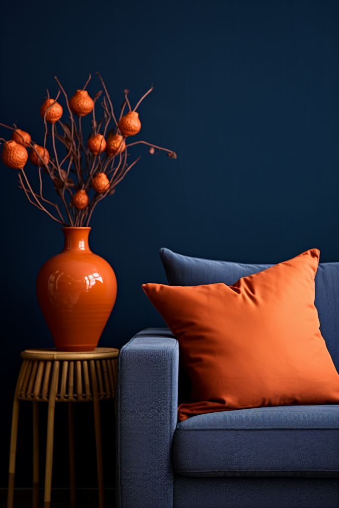
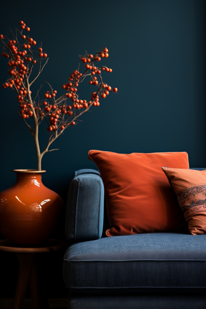
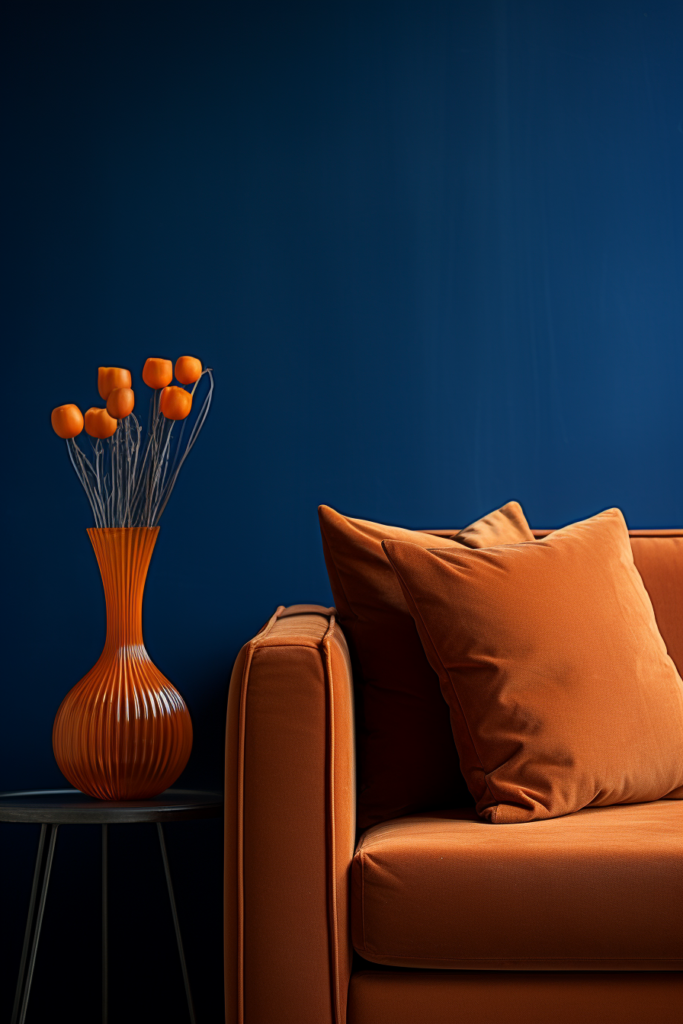
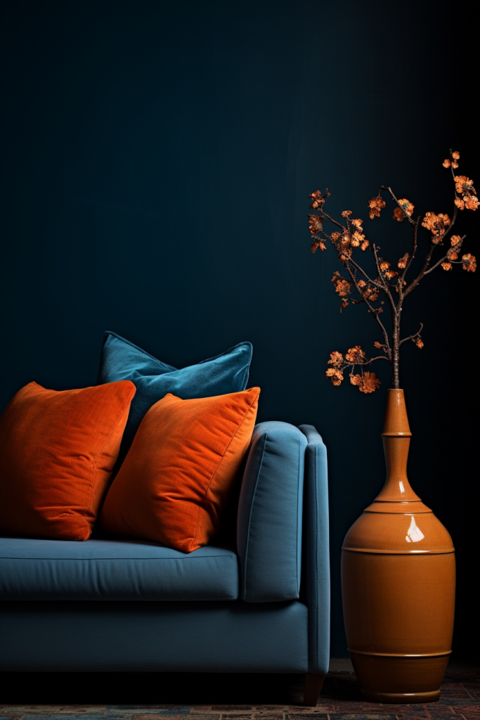
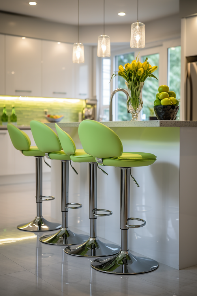
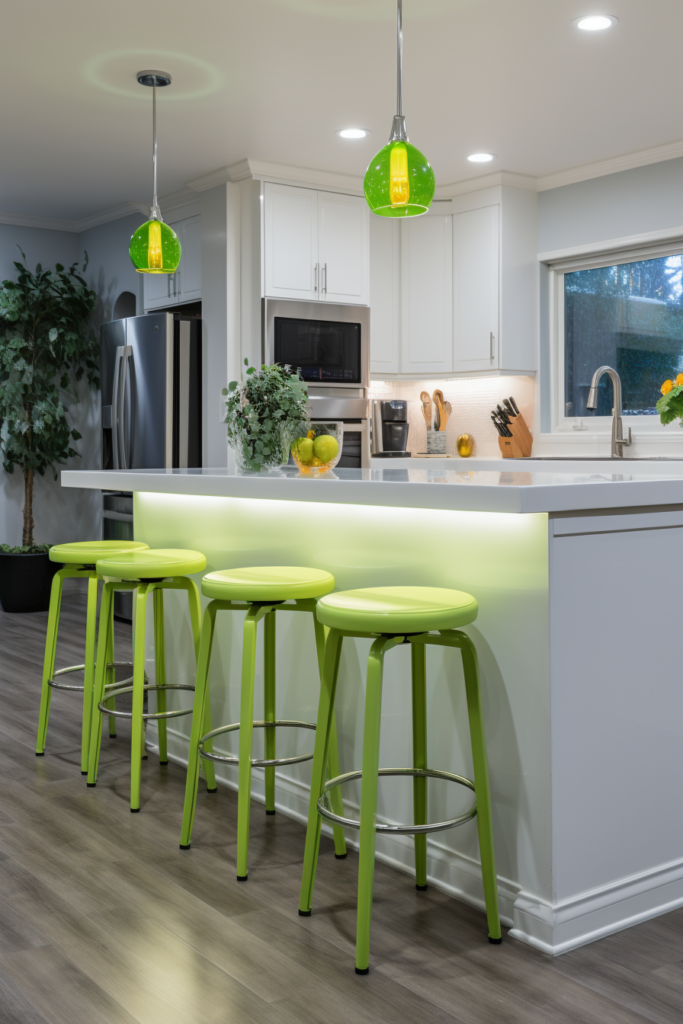
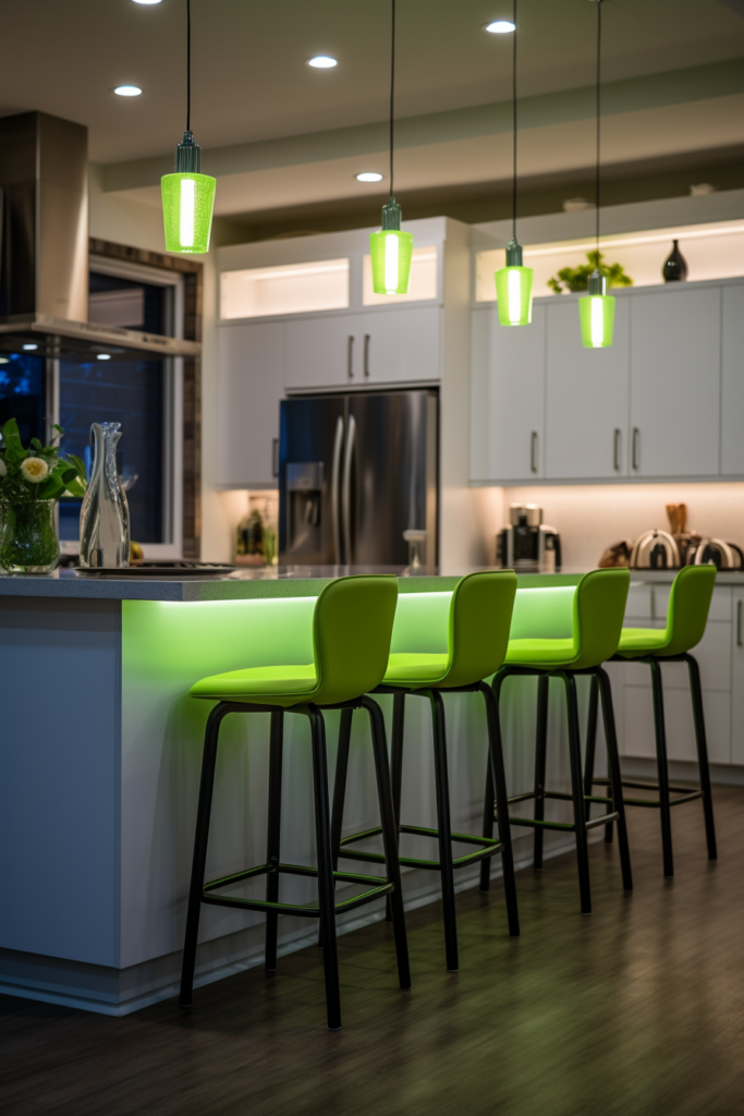
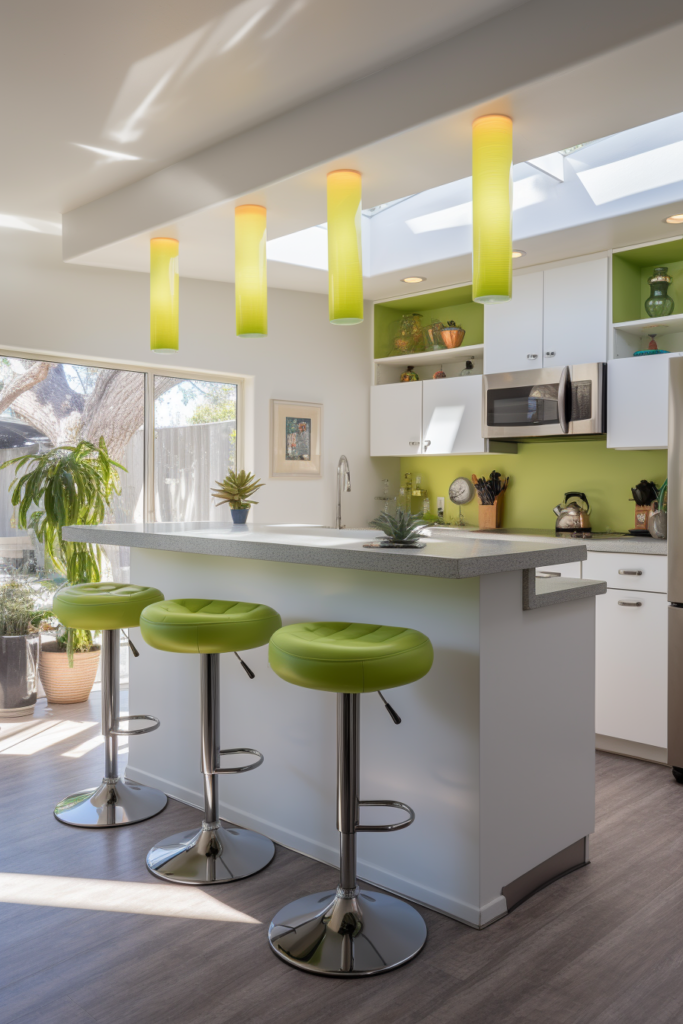
This punchy combination of rich blues, vibrant orange tones, and bright greens creates an eclectic, playful energy perfect for contemporary spaces.
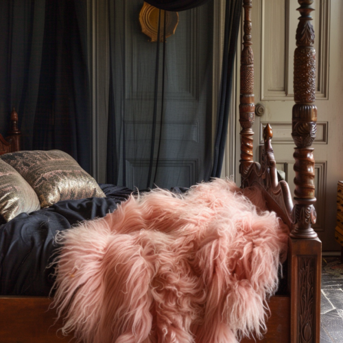
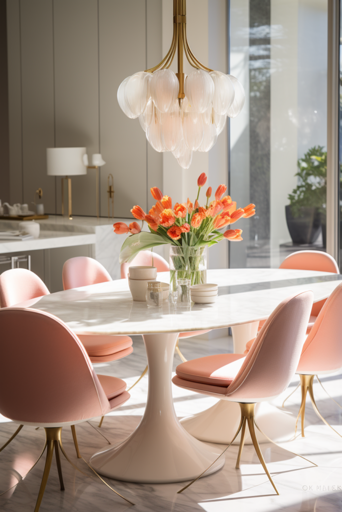
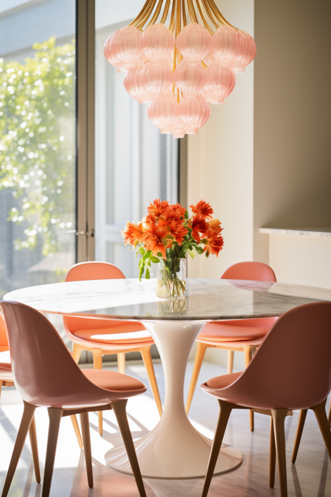
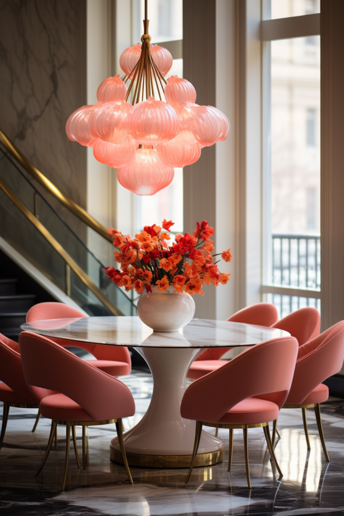
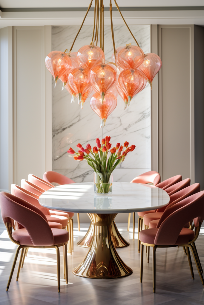
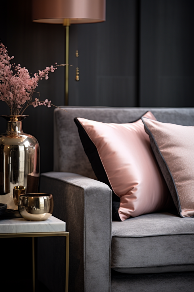
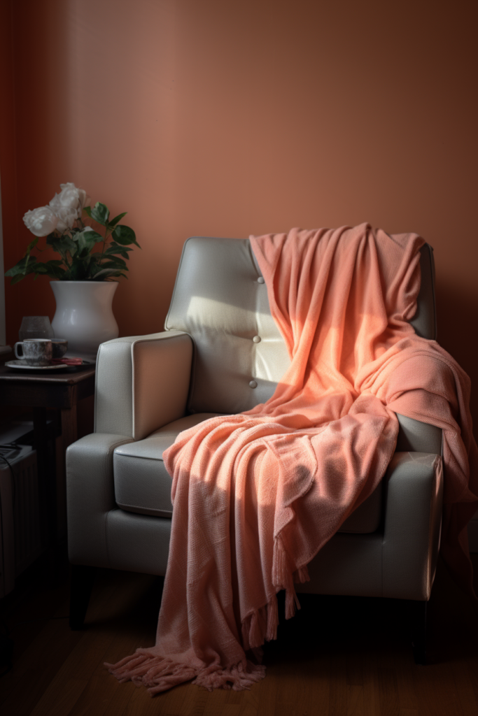
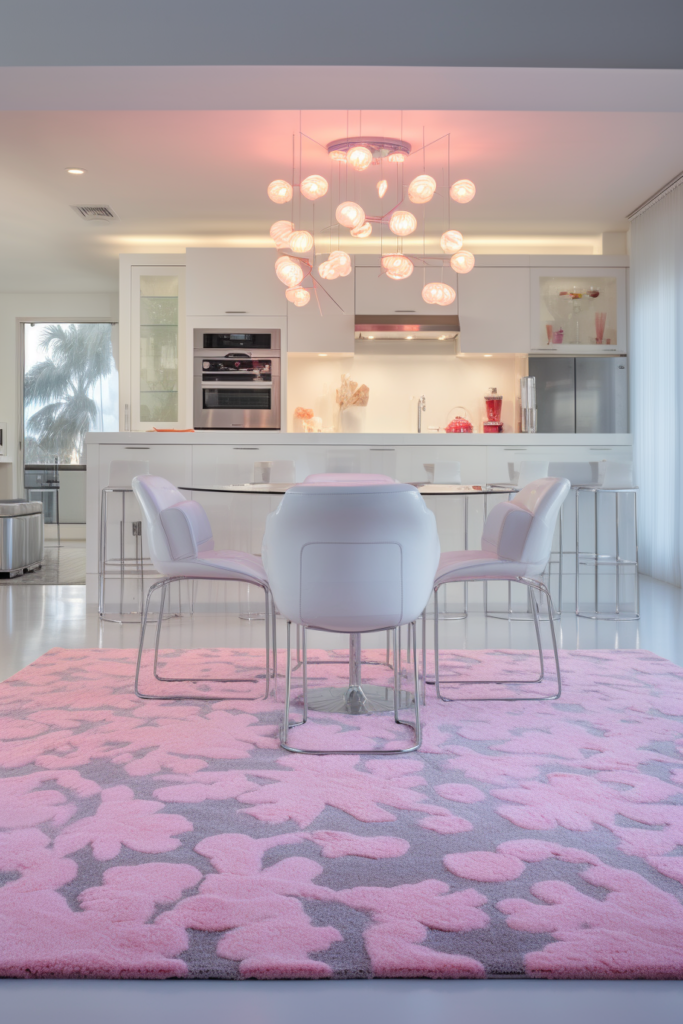
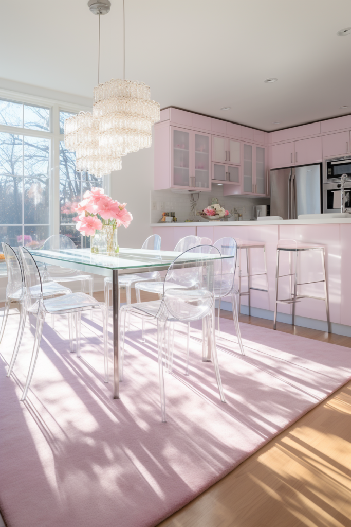
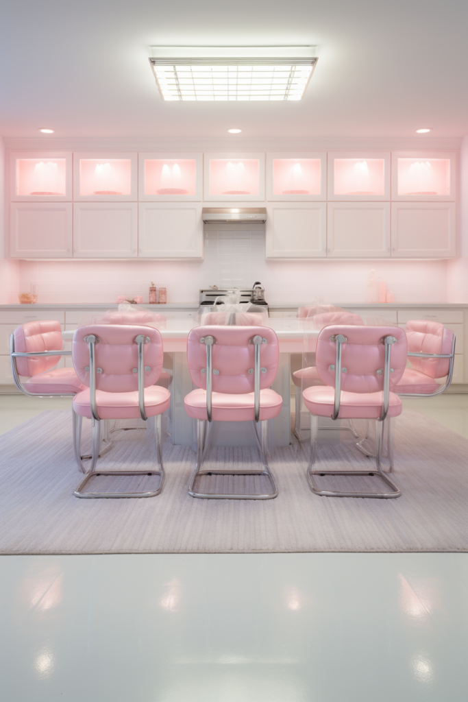
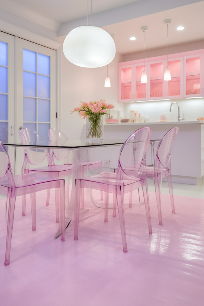
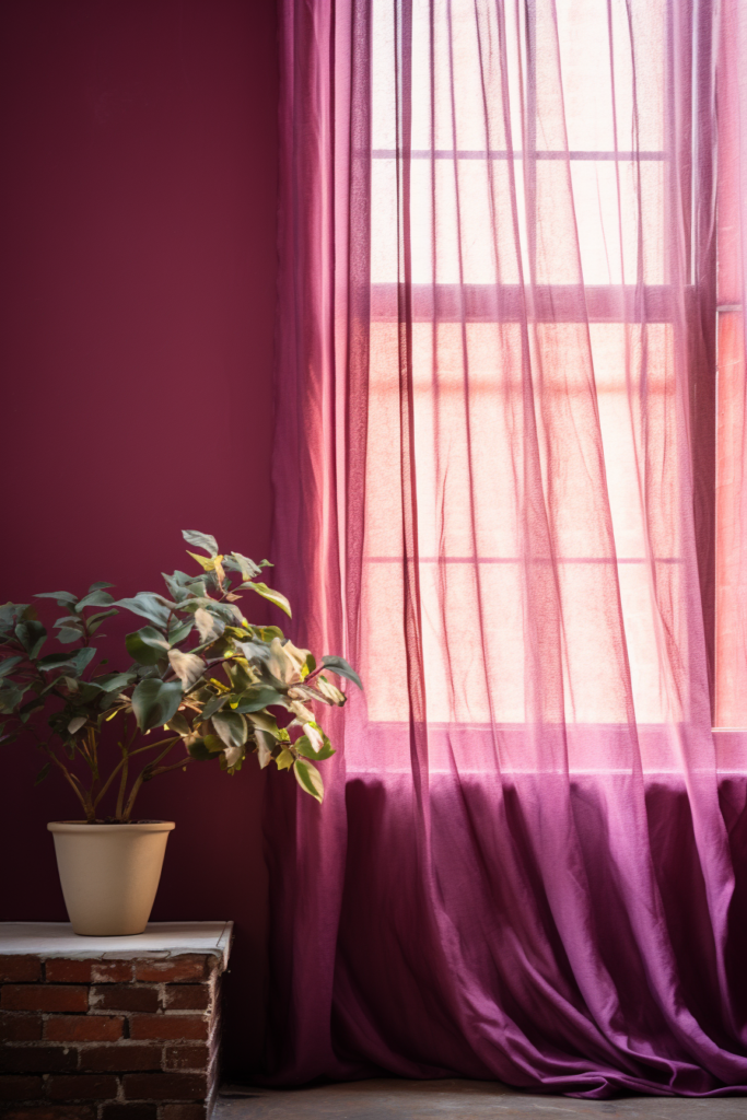
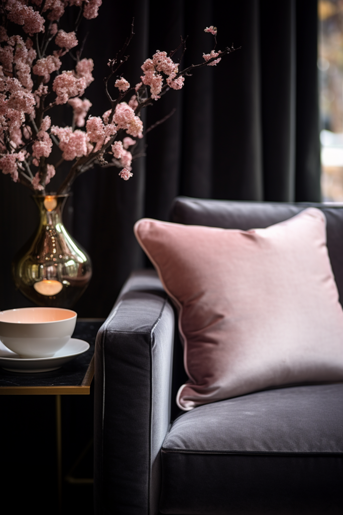
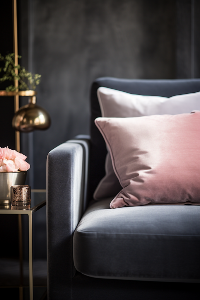
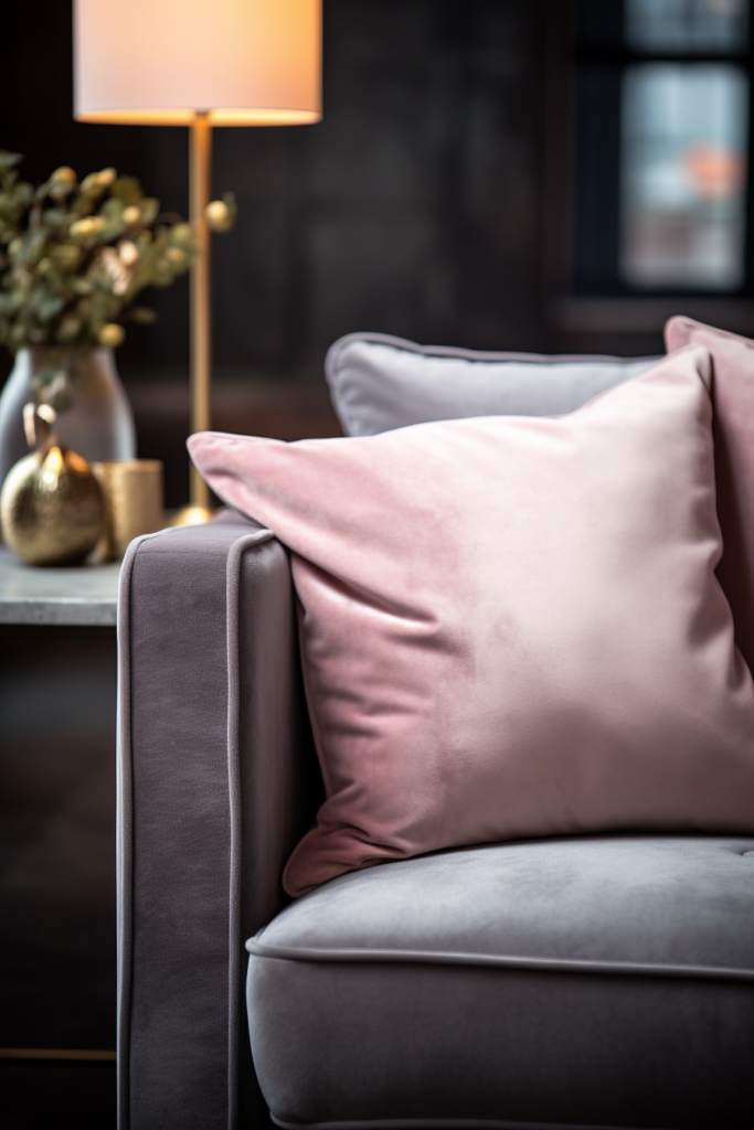
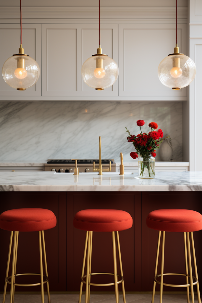
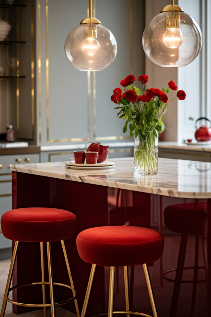
Color Scheme 2: Blush Pink, Sage Green and Deep Plum
Dominant Color: Dusty Pink
Tonal Variants:
- Blush Pink – Soft & Romantic
- Pale Pink – Sweet & Innocent
- Mauve Pink – Muted Gray-Pink
- Salmon – Warm Pink-Beige
- Strawberry – Punchy Vibrancy
Accent Color 1: Seafoam Green
Tonal Variants: 6. Seafoam – Cool & Misty
- Celadon – Porcelain-Like
- Aquamarine – Crisp, Jewel-Toned
- Pistachio – Happy, Bright
- Mint – Soothing Green Pastel
Accent Color 2: Cabernet Purple
Tonal Variants: 11. Plum – Sophisticated Richness
- Eggplant – Complex Gray-Purple
- Mulberry – Organic Berry Influence
- Lavender – Soft, Feminine
- Wisteria – Romantic, Decorative
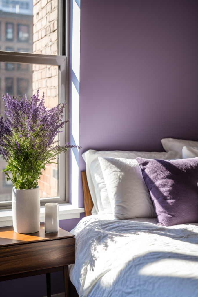
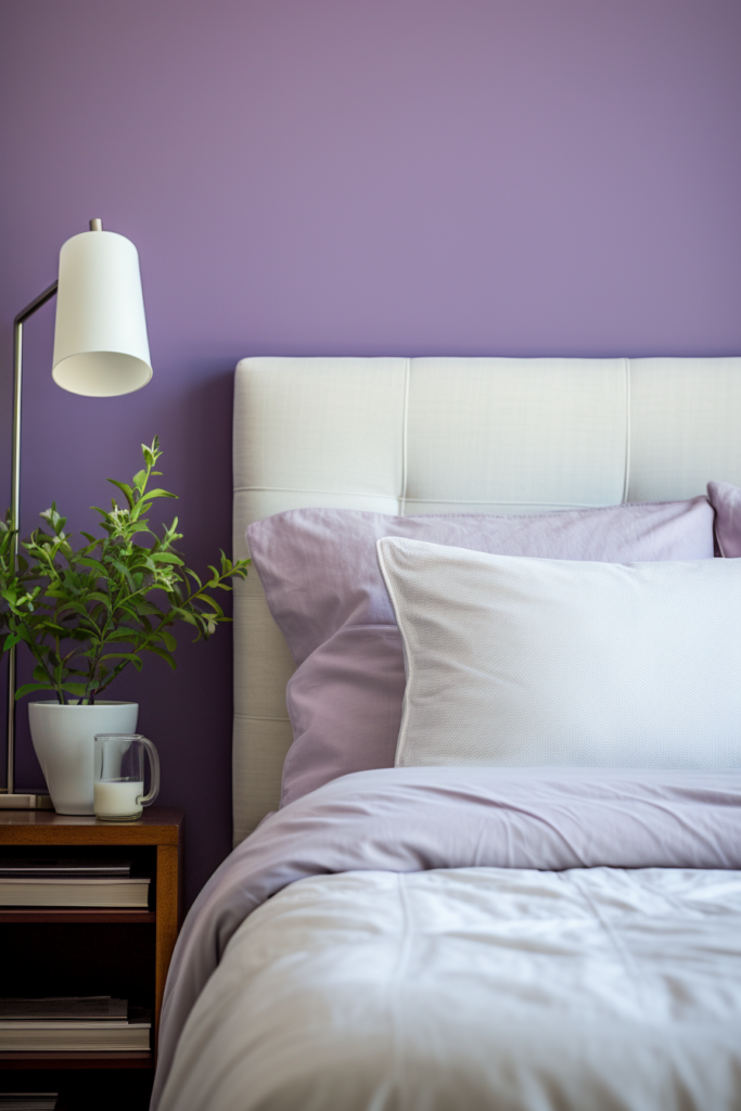
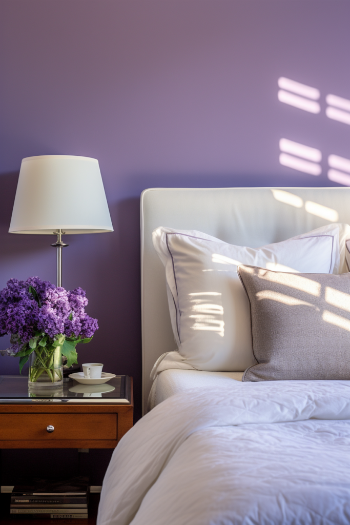
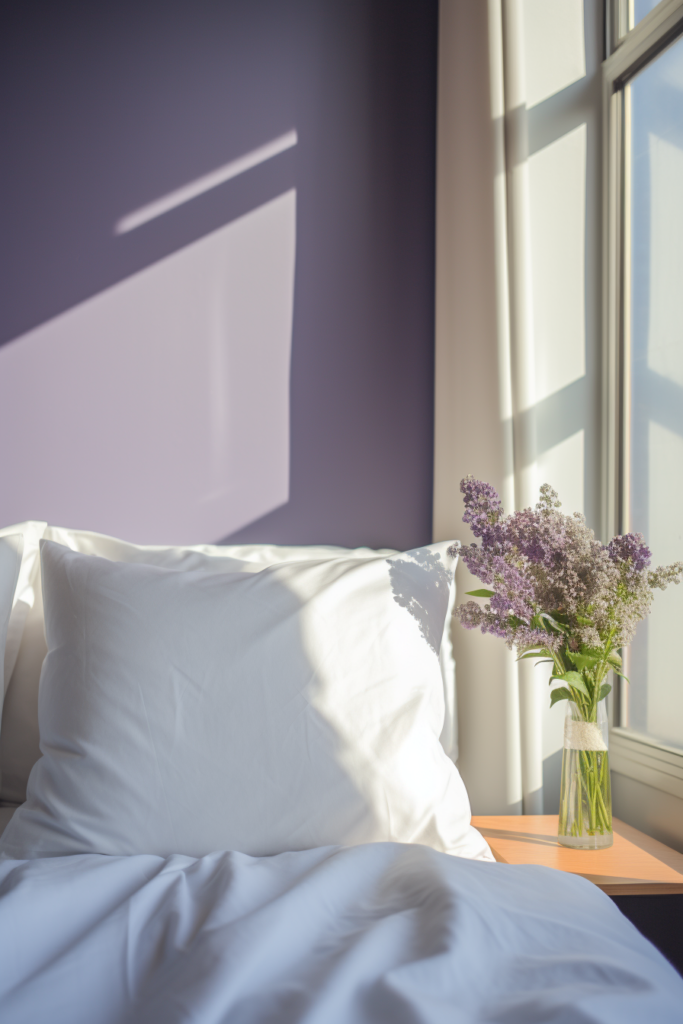
These feminine hues create a soft, romantic ambiance perfect for bedrooms or living spaces.
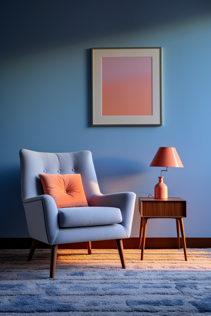
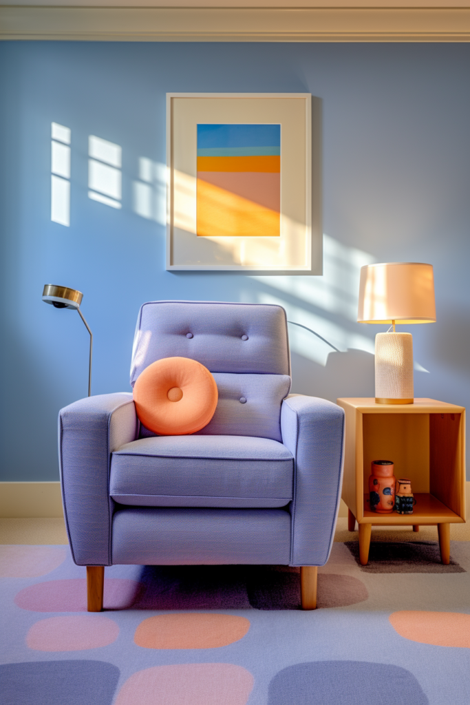
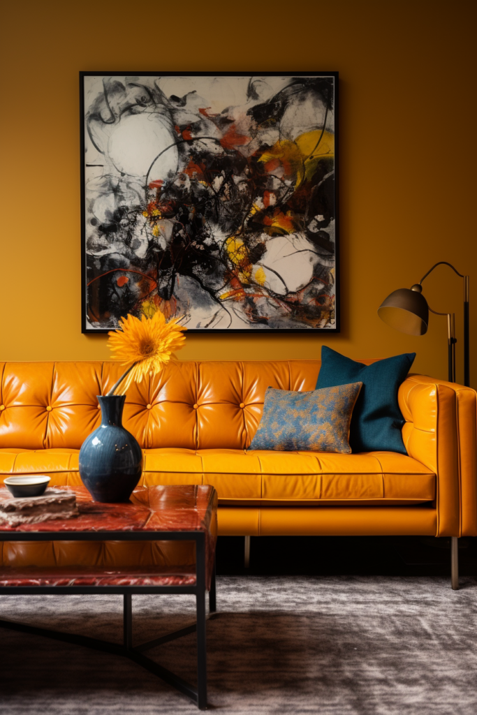
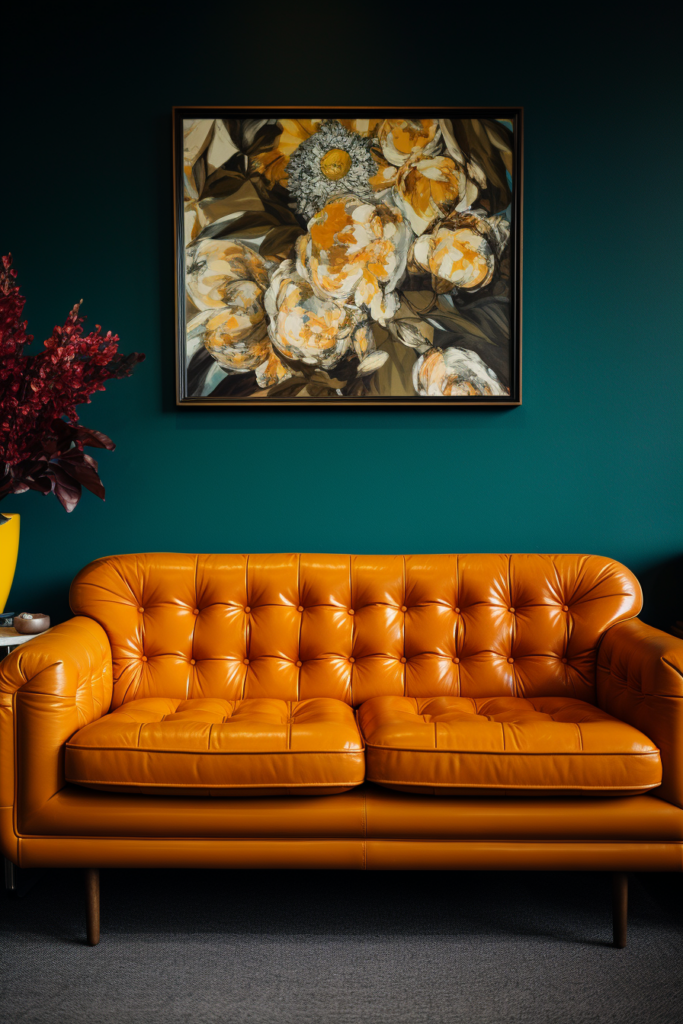
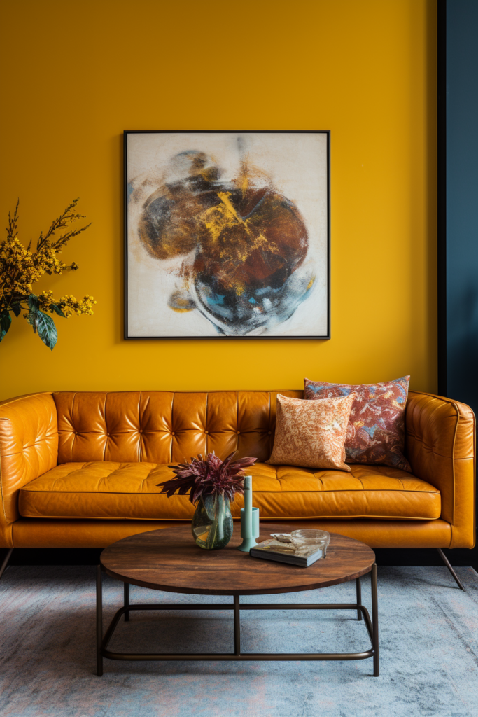
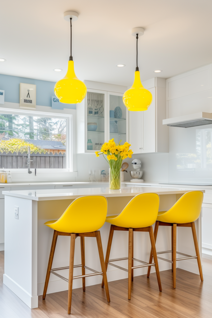
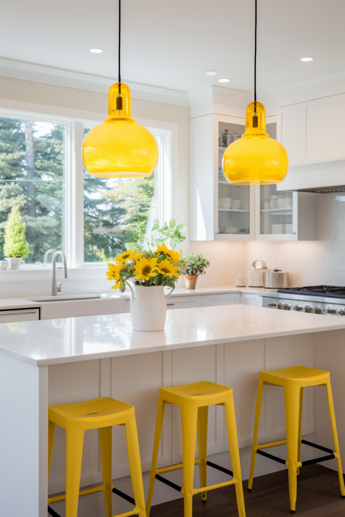
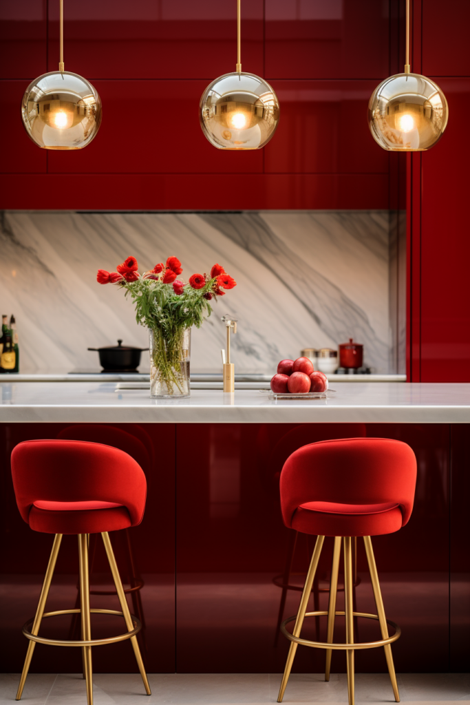
Color Scheme 3: Sunny Yellow, Cerulean Blue & Cherry Red
Dominant Color: Sunflower Yellow
Tonal Variants:
- Sunflower Yellow – Happy & Bright
- Lemon Yellow – Zesty, Energizing
- Mustard Yellow – Spicy, Earthy
- Gold – Warm Metallic Shine
- Buttercream – Soft, Creamy

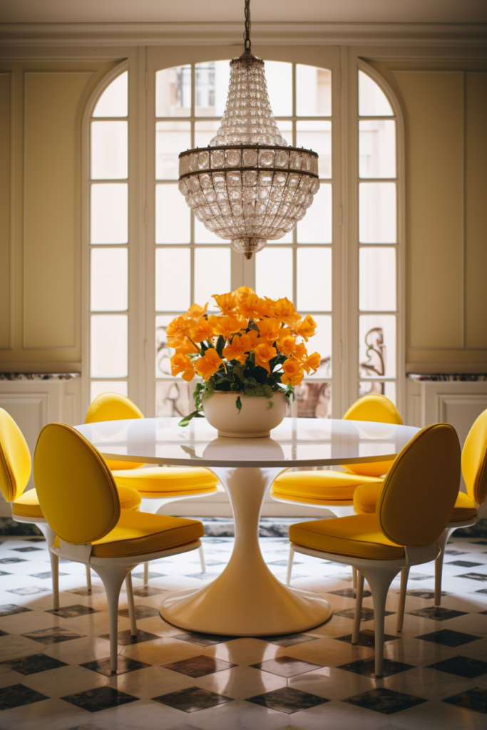
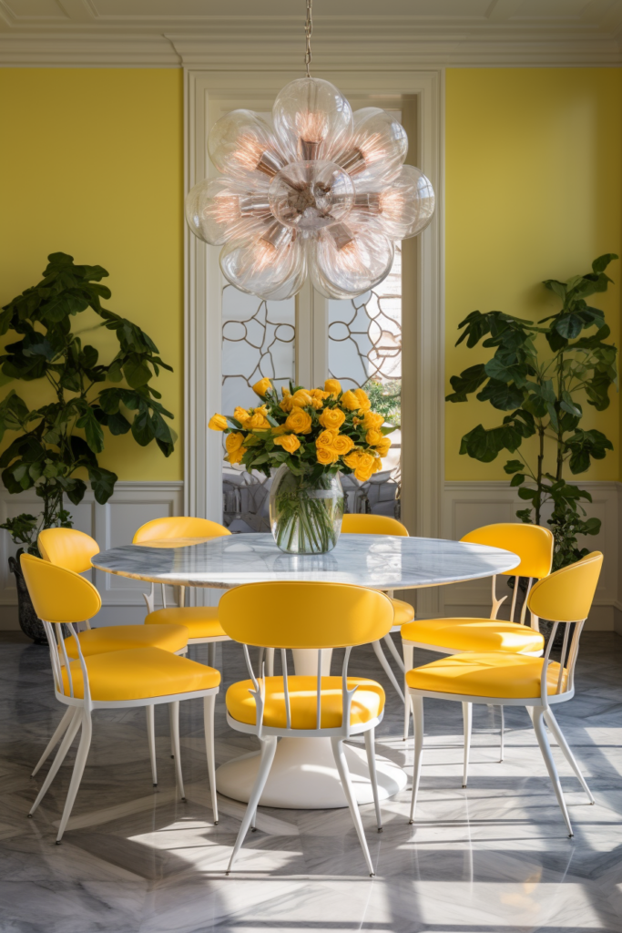
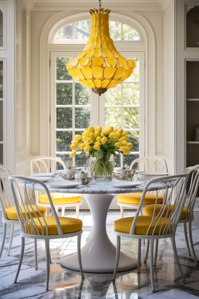
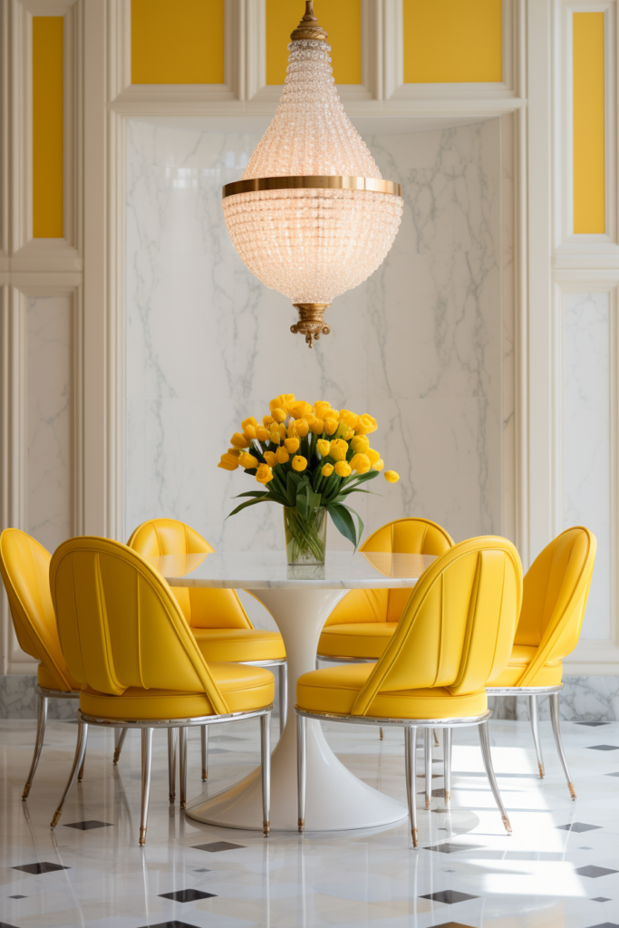
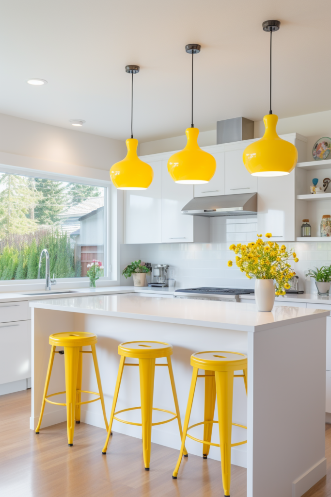
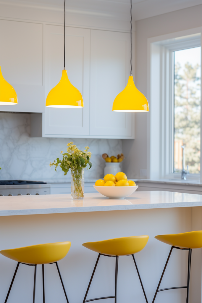


Accent Color 1: Royal Blue
Tonal Variants: 6. Primary Blue – Classic & Vibrant
- Periwinkle Blue – Sweet Pastel
- Denim Blue – Reliable Favorite
- Cerulean Blue – Cool, Sophisticated
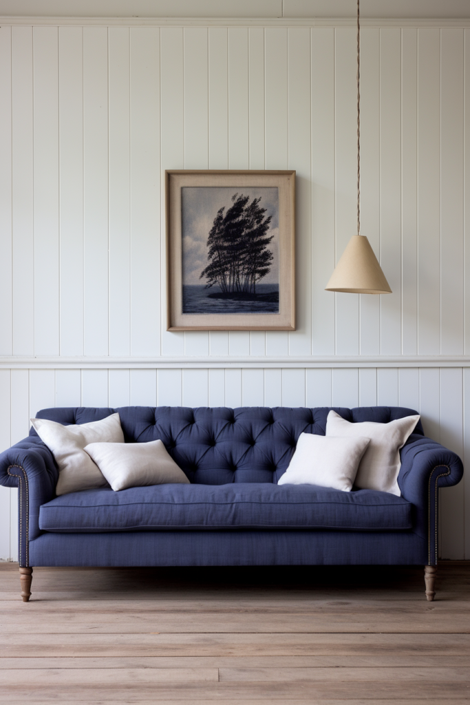
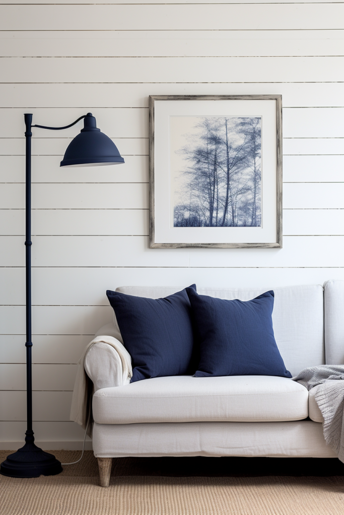
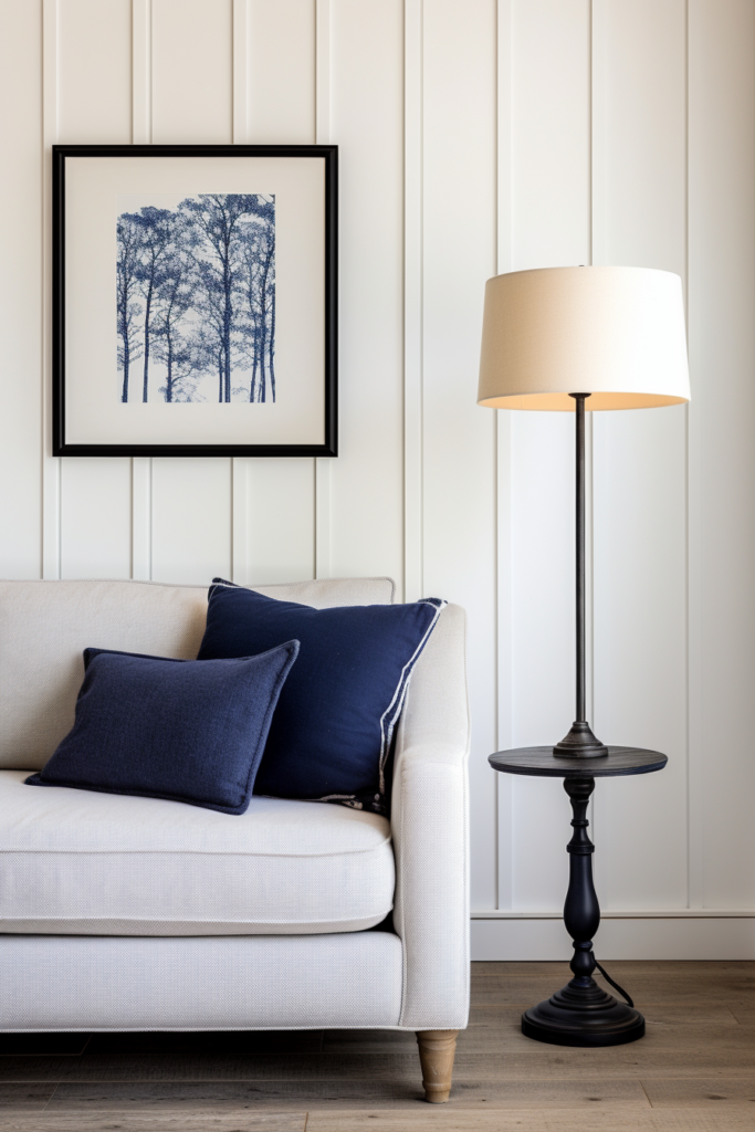
- Navy Blue – Bold, Dramatic
Accent Color 2: Crimson Red
Tonal Variants:
- Cherry Red – Exuberant, Juicy
- Scarlet – Attention-Catching Punch
- Brick Red – Rustic, Natural
- Cranberry – Dark richness
- Pink – Soft, Faded Red
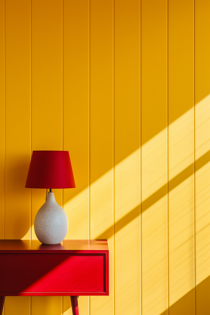
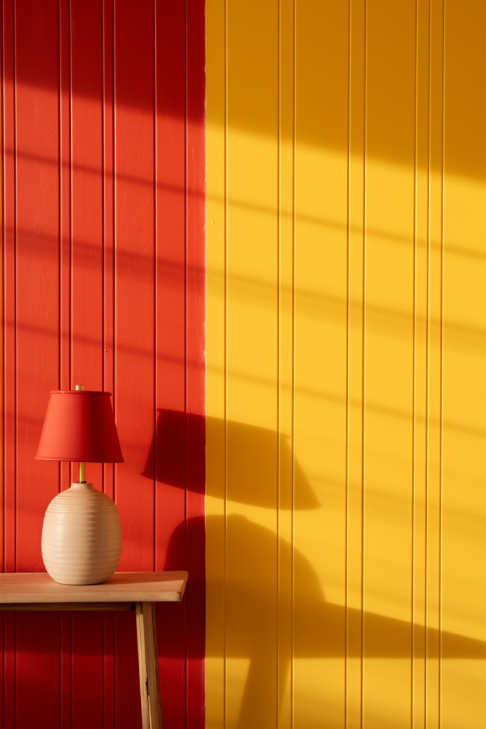

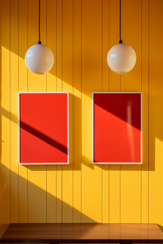
This lively combo of primary brightness with energizing accent pops creates a youthful pep perfect for kids’ spaces or making a bold, lively statement.
How to Harmonize and Unveiling the Power of Triadic Color Schemes Step by Step
Selecting the perfect color palette for your interior design project can seem overwhelming, with so many potential color combinations to choose from.
However, thoughtfully curating just three colors that work cohesively together can create a harmonious flow in any space.
In this comprehensive guide, we will walk through a strategic step-by-step approach to building a seamless triadic color scheme – a technique that interior designers have relied on for decades to effortlessly incorporate three colors in complete harmony.
By understanding the fundamentals of color theory and intentionally balancing undertones, you, too, can unlock the power of triadic color schemes to inject vibrancy and visual interest into your home.
Step 1: Grasp the Basics of Color Theory
Before diving straight into color selection, it’s important to build foundational knowledge of color relationships. Let’s quickly overview some key concepts in color theory:
Hues, Tints, Tones and Shades
- Hues – The pure pigments on the color wheel are red, blue, and green.
- Tints – Created by adding white to a hue to lighten it.
- Tones – Gray added to a hue for a muted effect.
- Shades – Black added to darken the vibrancy of a hue.
Key Color Scheme Types
- Monochromatic – Variations of one single hue.
- Complementary – Opposite hues on the wheel, like red & green.
- Analogous – Neighboring hues like yellow, yellow-orange, orange.
- Triadic – Three hues evenly spaced apart on the wheel.
5 Key Takeaways
- Hues are pure pigments, the originating colors.
- Tints, tones, and shades modify hues by adding white, gray, or black.
- Monochromatic utilizes shades, tones & tints of one hue.
- Complementary combines opposite hues from the color wheel.
- Triadic forms a color scheme from 3 evenly spaced hues.
Step 2: Define Your Color Story
Every interior has an essence you want its aesthetic to evoke. Before randomly choosing three colors, intentionally define the feeling, mood, and ambiance you wish to cultivate. This becomes the color story that will guide your hue selection.
For example, if your vision is a soothing, minimalist oasis of relaxation for a master suite, you’ll likely lean towards cool, subdued hues like tranquil blues and greens. Contrarily, to infuse happiness and whimsy into a little girl’s room, hot punchy pinks, sunny yellows, or playful pastels will better support that story.
5 Key Takeaways
- Identify the desired mood for the space – relaxed, energetic, elegant.
- Align color choices to match the vision & feeling.
- Cool, muted hues for serene spaces.
- Hot brights & neons for high-energy rooms.
- Soft pastels to cultivate sweetness & whimsy.
Step 3: Determine a Dominant Hue
With a defined color story, the fun really begins – curating your very own custom triadic color scheme! First, determine the dominant hue that sings strongest to the ambiance you envision.
As an anchoring 60% presence, choose this color wisely as a tone that speaks to you…one that makes your heart sing every time you see it. If you change your mind later, switching up 10-30% accent colors is far easier than replacing an entire room’s worth of a heavy dominant color.
5 Key Takeaways
- The dominant hue will comprise roughly 60% of the space.
- Ensure the tone aligns well with the overall color story vision.
- Changing the dominant color means a major overhaul down the road.
- Better to change accent colors instead, if needed.
- Choose a resonant hue that enlivens the soul.
Step 4: Select Two Accent Equidistant Hues
Once you lock in that gorgeous dominant color, unveil the beauty of triadic harmony by choosing two accent hues positioned equidistant around the color wheel.
For example, if bold cobalt blue is your hero, vivid cherry red and zesty lemon yellow – equally interspersed hues – seamlessly round out the palette.
Calculate placement by dividing the wheel into even thirds. Your accent hues will occupy the resulting pie slices on both sides of the dominant color to form a harmonizing color triangle. Not quite following? YouTube has great visual examples demonstrating triadic selection.
5 Key Takeaways
- Triadic hinges on even spacing between 3 hues around the wheel.
- Slice wheel like pizza to determine accent hue places.
- The dominant color sits on the “top,” and accent colors on the lower sides.
- It should form an equilateral “color triangle”.
- Check YouTube for a visual walkthrough, if needed.
Step 5: Mind the Undertones
Even when hues seem harmonious on paper, clashing undertones can sabotage the balance when introduced into a space. It’s imperative accent colors share similar enough temperature undertones – either warm or cool – with the dominant hue so combinations don’t visibly vibrate.
For example, pairing a dominant warm orange-red with one warm yellow accent hue is beautiful. Throwing in a cool blue-purple radically shifts the temperature dynamic, resulting in disjointed friction. Study your shortlist combinations under natural lighting at different times of day to catch potential clashes before committing to your trilogy.
5 Key Takeaways
- Consistent color temperature creates cohesion.
- Mixing warm & cool tones risks disharmony.
- Study shortlist hues under natural light over time.
- Observe how combinations interact together.
- Adjust if undertones clash for visual friction.
Step 6: Map Out Your Color Distribution
When working in the constraints of an existing interior with furniture and finishes you can’t easily change, strategically mapping the color placement is key to success. Use large neutral surfaces like walls and flooring as anchoring foundations to layer your triad on top.
Plan dominant color for large applications – 60% walls/flooring. Weave accent one throughout 30% soft furnishings. Use Accent 2 sparingly – 10% punctuation on toss pillows/accessories, providing punch without overwhelming. For ultimate harmony, integrate all three colors in every space at these approximate ratios.
5 Key Takeaways
- Anchor scheme with dominant neutral walls/floors.
- Layer dominant hue over 60% surface area.
- Accent 1 on 30% – soft furnishings, furniture.
- Use Accent 2 minimally – toss pillows and vases.
- Stick close to the 60/30/10 distribution target.
Step 7: Repeat Your Colors Harmoniously
The beauty of thoughtfully planned triadic interplay is the seamless way colors effortlessly play off each other as they recur throughout the home. While keeping hues in proper proportionality, creatively riff off your original trio, mixing tints, tones, and shades.
If cardinal red is a bold Accent 2 splash punctuating bright white walls, try working in softer blush tones on bedding, echoing the scarlet hue. Revisit Accent 1 chartreuse filtered through sunlit sheers, brightening up the space. Intentionally repeating harmonic hues instills balance.
5 Key Takeaways
- Revisit three colors through various tints and shades.
- Maintain original ratio equilibrium.
- Soften bold hues into lighter, ethereal tints.
- Shift values gradually without drastic contrast.
- Produce balance through harmonious repetition.
Step 8: Textures & Patterns Prevent Flatness
A common pitfall when working intensively across a tightly defined color palette is falling into visual flatness. While hues may perfectly support the intended mood, limiting your selection to only flat-painted surfaces can start to feel monotonous.
Create depth and visual interest by incorporating textural fabrics, layered rugs, graphic wallpapers, and punchy patterns interacting beautifully with your trilogy foundation. Mix glossy ceramics with cozy cable knits. Juxtapose smooth velvets on pillows over textural linen upholstery. Patterns and texture breathe life into color.
5 Key Takeaways
- Too much flat color looks uninspired & dull.
- Incorporate tactile textures – cables, boucles.
- Layer on punchy graphic patterns.
- Play with light reflection on glossy surfaces.
- Vary sheens – matte, eggshell, gloss.
Step 9: Showcase Your Color Story Through Artwork
Nothing immerses you more fully into a thoughtfully designed color experience than the visually powerful inclusion of compelling artwork. Use your framed pieces almost as giant swatches – vivid showcases reinforcing key colors in their purest essence.
Continuing our blue hero example, accessorizing with brilliant marine photography, abstract ultramarine pieces, or a color field study featuring your cobalt center stage visually reemphasizes the starring hue. Work art in sparingly to sustain equilibrium allowing colors themselves to captivate.
5 Key Takeaways
- Strategically select artwork echoing 3 key hues.
- Vibrant photography energizes color palette.
- Color field studies proudly highlight hero colors.
- Position art minimalistically for maximum focus.
- Let curated color trios take center stage.
Step 10: Confidently Add Pops of Black and white
Once your triadic trilogy feels harmoniously balanced, gild the lily by punctuating your palette with lush black and crisp white for ultimate sophistication. When stitched judiciously into an interior, these powerful neutrals frame vibrant colors superbly with little risk of clashing if kept in smaller doses.
Paint architectural trim or ceiling beams with deep black to beautifully ground color-drenched walls in bold contrast. Crisp white molding & chair rails smartly attenuate intensity. Ebony frames, table bases, and pendant lights glamorously anchor palettes, letting hues shine brighter. White artwork mats polish combinations to perfection!
5 Key Takeaways
- Judicious black & white Bennett color combos.
- Dark architectural elements ground colorful walls.
- Crisp white molding handsomely frames vibrancy.
- Black accents & frames let hues take the lead.
- White mats & ceramics refresh and sharpen palette.
In Summary
Skillfully blending three colors in perfect harmony may seem like an advanced challenge, but properly equipped with fundamental color theory, a step-by-step strategy, and an intuitive eye for balance, a world of triadic possibilities awaits your experimentation.
Begin by simply defining a color story and mood for your space. Effortlessly build from there, trusting your vision to guide color selections as you unlock the visual potency inherent in thoughtfully interweaving just three hues.
Follow Quiet Minimal on Pinterest for more home design tips and inspiration.